Portfolio
Collection of my data analysis projects, maps and visualisations

Dissertation Project: Urban liveability in Auckland
For my dissertation project I created an urban liveability composite indicator for the city of Auckland, New Zealand. Its analysis revealed findings about the relations between liveability and sociodemographic characteristics of the population.
Q-Step Research Internship


Melbourne Cafes Agent Based Model
Spatially explicit agent based model of pedestrians walking to cafes in Melbourne, prepared as an assessment for a class.
Melbourne road traffic animation
This animated map was created in Python by plotting the road network with line width represented by traffic value for each hour of every day of the week.

Visualising population change in cities
A map showing the world’s largest cities and their growth projections for the future. I created the map with Mapbox GL JS. An alternative viz made with Tableau, also shows the data with charts.
Woolies or Coles?
Interactive map of Australia, divided into sections closer to a Woolworths/Coles store. Made with Mapbox GL JS.

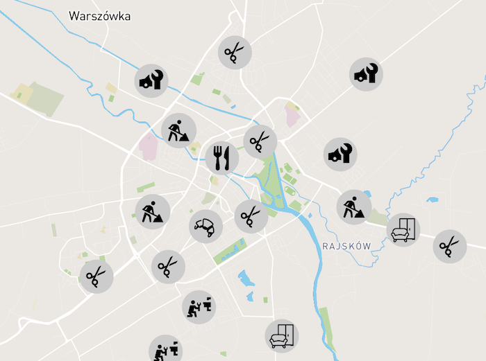
Web map for a local website
This map showcases local businesses, distinguished by their categories linking to their respective site. Created with Mapbox GL JS.
Other projects
Other projects and maps I created as part of university assignments.