Visualising population change in cities
How was this map created?
Step 1:
Collecting Data
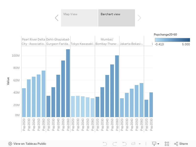
Data comes from this website on urban population change created by Jens Kwass. It showcases the metropolitan areas of the world and predictions on their growth in the years 2030, 2040, 2050 and 2060. The first step of gathering the data was to copy all the data points and attributes and create a dataset. I opened it in an MS Excel spreadsheet and assigned the data to columns.
Step 2:
Data Wrangling
Now in order to make the data ready for analysis, I had to clean the data with different operations. For example, some data points are incomplete due to cities merging together into larger agglomerations over time. The final step was to carry out the appropriate calculations of the growth rate in cities over the years. For that, I simply added new columns with formulas calculating the growth rate. Then I also had to check the data for outliers. For example, the Abdullah Economy City will be a completely new development, so since the population is predicted to grow from almost zero to very high, that data may look unnatural compared to other cities.
Step 3:
Geocoding
The next part of the process is to geocode the locations of our cities. After all, the data provides just the city and country names, not their coordinates which we would need in order to position the cities on a map. For this process, I used CARTO – a platform for mapping that provides the service of geocoding data points by city names and countries. From there I had to export my geocoded data into a file that I could later open in QGIS.
Step 4:
Spatial Analysis
The next step was to look at the data points on a map and analyze them. I used a heatmap weighed by the data range of population change in cities between the years 2019 and 2025, 2030 and 2050. Using vibrant colours it is easy to represent which parts of the world are predicted to change the most. But before that I still needed to check for any errors, for example, some cities were not geocoded correctly because there were two cities with the same name but in different countries. Sometimes it is easy to spot these mistakes on a heatmap, however, they’re not always easily identifiable. Thus, I corrected some of these mistakes I could find, by editing datapoints in QGIS.
Step 5:
Completing the map
Now, the final step was to share what I’ve made online. So I exported the final data from QGIS and uploaded it into my Mapbox account. In there I created my heatmap and adjusted different layers to display the data in the best way. From there, I embeded my map onto my website and tweaked the features a little more. I also added a data viz created with Tableau. And there it is. That’s how I created my first map.
